May 21, 2026

Zero Sum Problems

Over at Daring Fireball, John Gruber makes a passing observation about the Apple Sports app:

I’ve got some gripes about certain specific aspects of Apple Sports. Like, where does one even start to explain how much is wrong with their zero-sum visualization of team stats? Has anyone ever even seen a presentation like that before? Anyone?
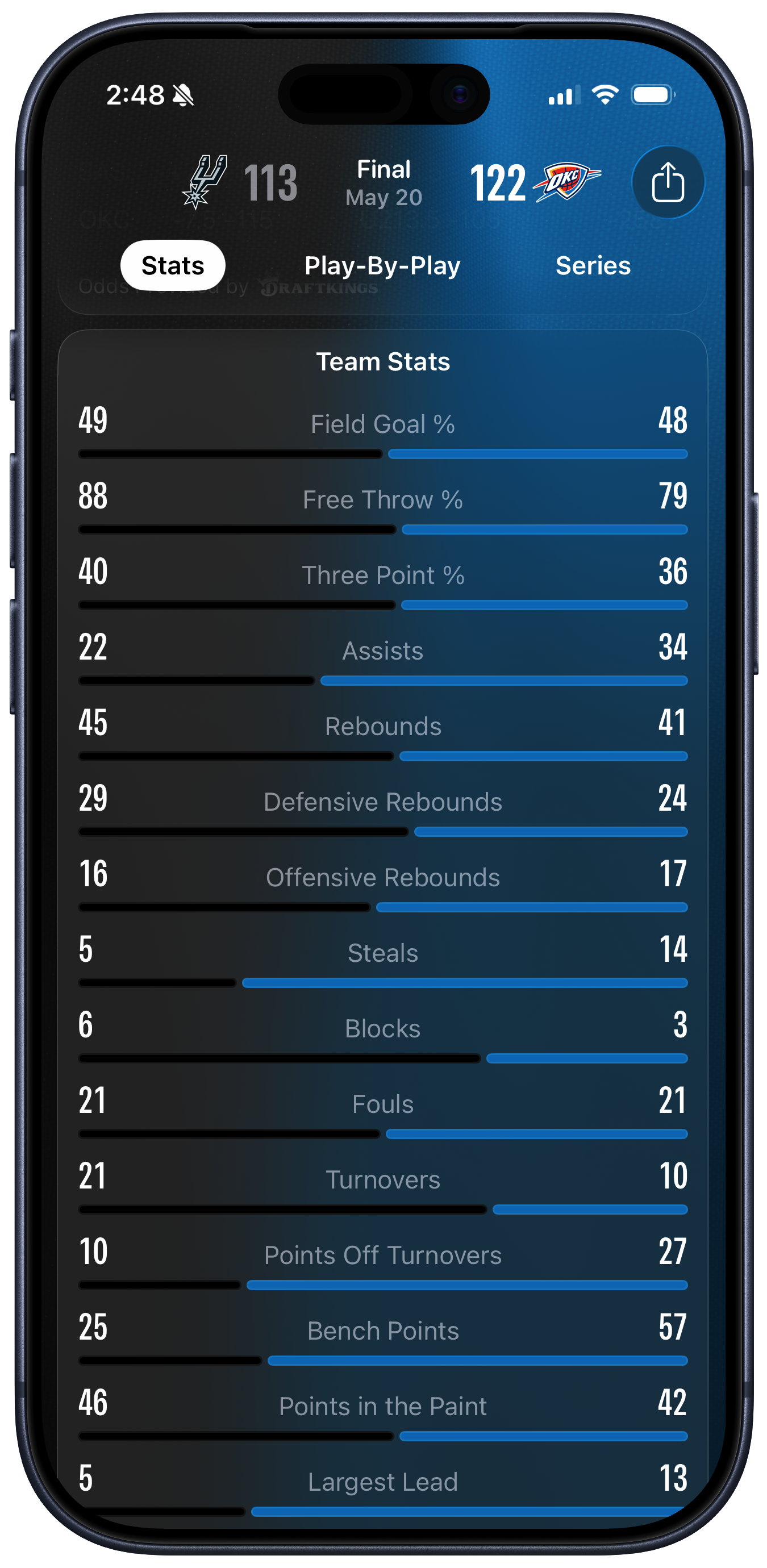
That “Anyone” link lands over here. Hi everyone! The team stats image is quite confusing. It’s a summary of a game between the San Antonio Spurs and the Oklahoma City Thunder. I don’t know much about basketball, but I do know a bit about data visualization and in a pleasing coincidence my former student Josh Fink is the A-VP of Basketball Data Science for the Spurs. Here is the image that John objected to: ❧ Continue reading…

May 2, 2026

Bad Weather and the Subway

Two figures walking in the snow; trees in the distance.

Snow in Inwood, New York. Photograph by the author.

Recently I’ve been looking at hourly ridership data from the New York City Subway. Last time we learned that people go to work in the morning and come home in the evening, for example. (All together now: “Only in New York, baby!”) Today we’ll learn that bad weather makes people stay at home. Except, sometimes it doesn’t. ❧ Continue reading…

April 25, 2026

Hourly Subway Station Flows

Pie charts are bad, as any fule kno. We’re not as good at judging relative differences between angles and areas as we are at judging relative differences in lengths on a common baseline. This is especially true when we have more than two things to compare at the same time. So, as a rule, you shouldn’t use them. You should figure out some other way of viewing your data instead. On the other hand, I just made 424 animated pie charts because if you’re going to break a rule you should break it good and hard. ❧ Continue reading…

April 19, 2026

New York City Hexmaps

The five boroughs of New York City can be informally or formally carved up into many different pieces, depending on what it is that you’re doing. As part of an ongoing project, I recently made an R package, nycmaps, that lets you draw maps of some of these geographies. Things being what they are, these spatial units don’t necessarily overlap in compatible ways. City, State, and Congressional Districts, School Districts, Police Precincts, Fire Companies, Election Precincts, Municipal Court Districts, Zip Codes … there are loads of them. Some of them are quite straightforward; others patiently lie in wait to trap unwary analysts (I’m looking at you, Zip Codes / ZCTAs). ❧ Continue reading…

March 28, 2026

Subway Sign

After the parking signs last time, here is a subway sign.

Subway sign with Queens-bound trains, headed No Kings

A borough-specific sign to display

Here’s a direct link to the PNG and the PDF. Once again, put it onna stick and exercise the constitutional rights to freedom of expression, speech, and assembly enjoyed by everyone in the United States. ❧ Continue reading…

Categories

Sociology (514) · Politics (346) · Misc (333) · Internet (143) · Visualization (125) · R (111) · Books (101) · News (97) · Data (88) · IT (59) · Gender (58) · Philosophy (58) · Nerdery (55) · Economics (54) · Obiter Dicta (39) · OrgTheory (29) · Apple (19) · Teaching (17) · Emacs (6) · PGR (6) · Gss (3)


All Posts

2026

May 21   Zero Sum Problems · May 2   Bad Weather and the Subway · April 25   Hourly Subway Station Flows · April 19   New York City Hexmaps · March 28   Subway Sign · March 23   Confessors in Harmony · March 9   Using Quarto to Write a Book · March 6   Data Visualization, Second Edition

2025

November 13   Ordinal Exchanges · November 10   Trustworthy Data Visualization · November 6   Mamdani vs Sliwa and Cuomo · October 28   GSS Release · October 25   Manhattan Plot of Manhattan · October 19   gssrdoc Updates · October 13   Parking Signs · October 8   Halloween in the Round · October 3   Iterating some sample data · August 21   The Road to Selfdom · August 7   Blueberry Hill · July 22   The Sound of Silence · July 9   Embeddable Mac · June 28   American · June 26   Razor, Gun, Fence · June 18   Oh Leave it Out · June 9   LA County Population · February 20   TSA Screening Volume and Epiweeks · February 19   MTA Ridership · February 16   Burn Notice · February 6   Kerning and Kerning in a Widening Gyre

2024

October 12   Halloween Data Cleaning · September 6   Dr Drang and the Electoral College · July 17   Apple's First Post-Taboola Event · June 1   A New York City Adults and Children Dotmap · May 31   A New York City Race and Ethnicity Dotmap · May 30   A Population Dotmap of New York City · May 29   Race and Ethnicity in New York City · May 20   Harrison White 1930--2024 · May 16   New York City's POC Population · May 8   Inspirational Quotes · April 16   Six to Ten Hours of Poly-Processing · April 15   gssr is now two packages: gssr and gssrdoc · April 12   Daily Average Sea Surface Temperature Animation · April 9   The Eclipse via Satellite · April 4   Make Your Own NOAA Sea Temperature Graph · April 1   gssr Update · March 28   Book Day · March 14   Pi Day Circles · March 3   A PCoA of New York City Neighborhoods and Street Tree Species · February 29   New York City's Street Tree Species · February 29   Street Tree Diameters and Income in New York City Neighborhoods

2023

December 21   The Ordinal Society Site · December 20   The Baby Boom Again · December 6   Dorling Cartograms · December 2   gssr Update · August 10   Flipbookr for Quarto · June 19   The Naming of Stats · May 10   Free Speech Tsar · March 30   Assault Deaths in the OECD 1960-2020 · March 29   Life Expectancy and Health Spending in the OECD · March 25   Reading Remote Data Files · January 8   Escaping the Malthusian Trap

2022

July 22   Unhappy in its Own Way · June 29   Skyline Timeline · June 24   New York Building Ages · June 23   Manhattan Building Heights · May 20   Every Springer Math Text · May 11   Academia Explained · April 27   Map and Nested Lists · April 10   Indexing Iterations with set_names() · April 8   Iterating on the GSS · February 15   Clustering Pundits · February 14   Desktop Mac

2021

December 19   Comparing Distributions · October 30   The Polarization of Death · October 21   Excess Deaths in 2020 · October 9   Building a PDP-11/70 Kit · September 3   Covid Trajectories · May 4   Map, Walk, Pivot · May 2   Contributions to the Literature · February 24   Excess Deaths February Update · January 26   Income and Happiness · January 8   What Happened?

2020

December 18   Cross National Death Rates · October 10   Excess Deaths Overview · October 8   Excess Deaths by Jurisdiction · October 6   Excess Deaths by Cause · October 1   Walk the Walk · September 26   National Weekly Death Rates · September 24   US Excess Mortality · September 14   Dataviz Interview · August 25   Some Data Packages · June 3   The Politics of Disorder · May 23   Get Apple's Mobility Data · May 21   The Kitchen Counter Observatory · May 9   Covid Concept Generator · April 28   New Orleans and Normalization · April 23   Apple's COVID Mobility Data · April 16   Upset Plots · April 10   Covdata Package · March 28   This Is Just to Try to Say