Psychology vs Organizations in Organ Procurement
Via Sally Satel, here’s a bit from a Freakonomics discussion. Stephen Dubner asked a bunch of people, “How much progress have psychology and psychiatry really made in the last century?” One of the respondents, Dan Ariely (a Professor of Management at MIT) cites some work about organ donation (emphasis added):
One of my favorite graphs in all of social science is the following plot from an inspiring paper by Eric Johnson and Daniel Goldstein. This graph shows the percentage of people, across different European countries, who are willing to donate their organs after they pass away. When people see this plot and try to speculate about the cause for the differences between the countries that donate a lot (in blue) and the countries that donate little (in orange) they usually come up with “big” reasons such as religion, culture, etc. But you will notice that pairs of similar countries have very different levels of organ donations.
For example, take the following pairs of countries: Denmark and Sweden; the Netherlands and Belgium; Austria and Germany; and (depending on your individual perspective) France and the U.K. These are countries that we usually think of as rather similar in terms of culture, religion, etc., yet their levels of organ donations are very different.
So, what could explain these differences? It turns out that it is the design of the form at the D.M.V. In countries where the form is set as “opt-in” (check this box if you want to participate in the organ donation program) people do not check the box and as a consequence they do not become a part of the program. In countries where the form is set as “opt-out” (check this box if you don’t want to participate in the organ donation program) people also do not check the box and are automatically enrolled in the program. In both cases large proportions of people simply adopt the default option.
You might think that people do this because they don’t care — that the decision about donating their organs is so trivial that they can’t be bothered to lift up the pencil and check the box. But in fact the opposite is true. … The organ donation issue is just one example of the influence of rather “small” changes in the environment (opt-in vs. opt-out) on our decisions.
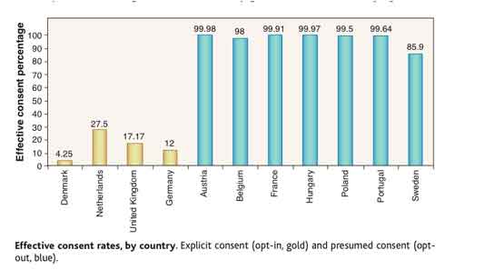
Johnson and Goldstein’s work on the role of default options in decision-making is good, but the figure above (especially with its y-axis labeled “Effective Consent Percentage”) is misleading as presented by Ariely. First he says, correctly, that the data show “the percentage of people, across different European countries, who are willing to donate their organs after they pass away.” But then he says, wrongly, that “similar countries have very different levels of organ donations.” The graph shows the number of people who say they are willing in principle to be donors, and the large difference that the default option to this question makes. The casual reader might think—as Ariely himself seems to—that the actual rate of organ procurement in those presumed-consent countries is vastly higher than that in informed-consent countries. But this is not the case at all. The figure shows is how many people sign up given the defaults (opt-in vs opt-out), and not the rate of actual organ donors procured.
Here is a figure showing the organ procurement rate for various presumed- and informed-consent countries from the early 1990s to 2002 or so. Each green circle is the procurement rate for a particular country-year. (I want to focus on average differences between countries so I don’t show the time series itself. Click here for a figure showing the time trends.)
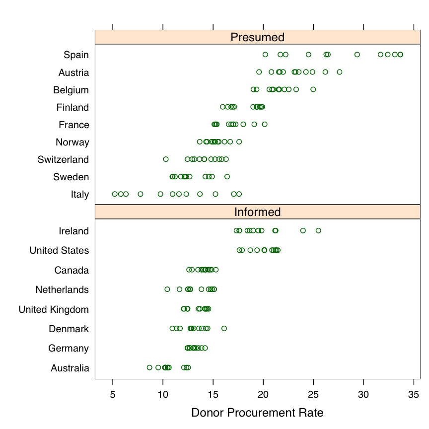
You can see that there are differences in the procurement rate between presumed- and informed-consent countries, and the highest-performing presumed-consent countries on average (Spain, Austria) score higher than the highest-performing informed consent countries. But the differences are not that big, and they are probably due mostly other features of the procurement system in the presumed consent countries. There is certainly not the huge disparity you might believe exists from a quick look at the post on the Freakonomics blog . (Incidentally, all of the countries shown here had their legal regime set as presumed- or informed-consent before the period covered by the data, so the often large within-country variability can’t be explained by the opt-in or opt-out defaults. Italy’s procurement rate, for instance, grew rapidly in the 1990s with no change in the law.)
In fact, as I’ve discussed recently in this post and argue in this paper, it is not at all clear that consent laws per se have any strong effect on the procurement rate (as distinct from their effect on people’s attitudes). Even if most people support organ donation, there are still large logistical hurdles to be overcome at the point of procurement. It is investment in the procurement infrastructure that really makes the difference to rates of organ donation, even if default options to opt-in or opt-out have large effects on people’s professed willingness to participate in the system.